
Level 1 · Lesson 2 · ~15 min
Price and time: how a chart is drawn
Every chart in our posts is built from two ingredients: price and time. Once you know which way each one runs, any chart turns into a story you can follow from start to finish.
Two directions: up is price, right is time
A price chart is a picture of where price has been. It has two directions, and each one means one thing.
Up and down is price. Higher on the chart means a higher price; lower means a lower price. Most charts print the prices down the right-hand edge, like the markings on a ruler standing on its end.
Left to right is time. The left side is earlier and the right side is later. The very right edge is the most recent moment.
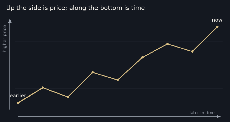
So a line that climbs as it moves right shows price rising over time. A line that slopes down shows price falling. A flat line means price barely moved.
Every candle is a slice of time
A chart doesn't draw every single trade. It cuts time into equal slices and draws one mark for each slice. On a line chart, each dot is the last price of its slice, and a line joins the dots. On a candle chart, each slice gets a candle, which the next lesson explains properly.
How long each slice lasts is the chart's timeframe. On a 5-minute chart, every candle covers 5 minutes: one for 9:30 to 9:35, the next for 9:35 to 9:40, and so on. Twelve of them make an hour. Lesson 4 looks at timeframes in more detail.
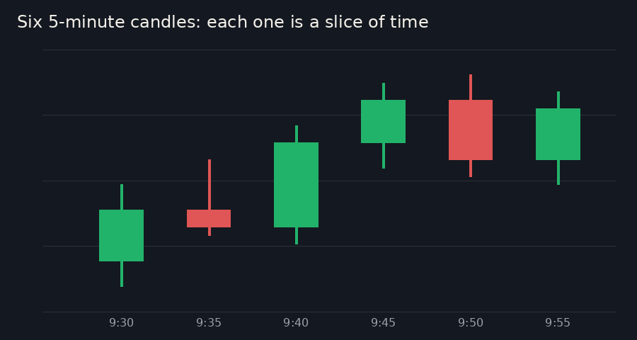
Think of a flipbook. Each page is one moment, and flicking through the pages in order shows the movement. A chart lays all the pages side by side, so the whole movement is visible at once.
Reading left to right
A chart reads like a sentence: left to right. Start at the left edge, follow price to the right, and keep asking one question: what did it do next?
The right edge is now. Everything to its left has already happened and won't change. On a live chart, a new slice appears at the right edge every few minutes and the older ones slide to the left.
When price climbs, it rarely goes in a straight line. It climbs like someone walking up a hill who takes a few steps back along the way. Each push up ends at a peak: a high point before price turns down for a while. Each step back ends at a dip: a low point before price turns up again.
In a climb, each peak is higher than the one before, and each dip stops higher than the one before. That staircase is what traders mean when they say price is going up.
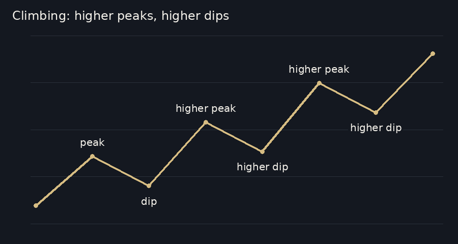
Traders shorten this to "higher highs and higher lows". Our posts use the same words: a higher low is a dip that stopped above the last one.
Falling, and going nowhere
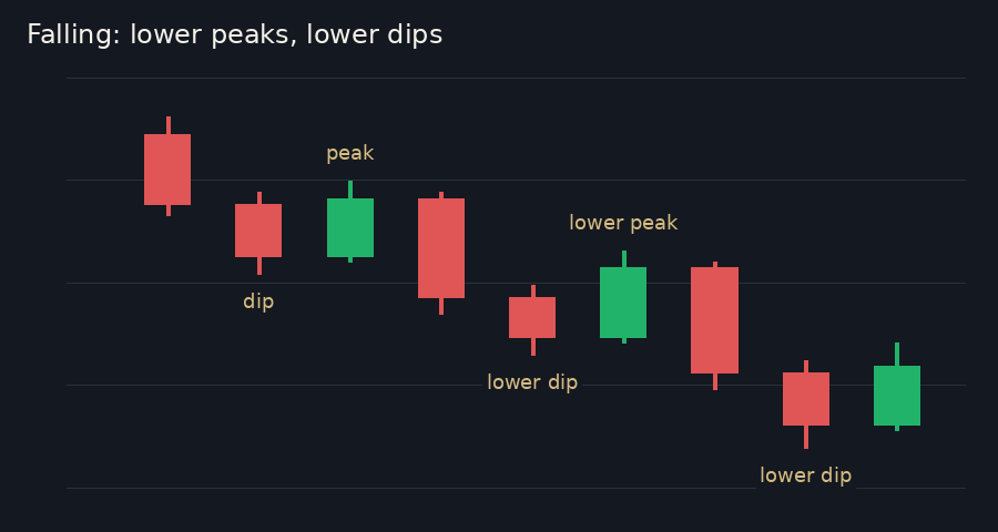
A fall is the same staircase turned upside down. Each peak is lower than the last, and each dip goes lower than the last.
Sometimes there is no staircase at all. The peaks stop at about the same height, the dips stop at about the same depth, and price swings back and forth between them. That is price going sideways. Later lessons give these shapes their proper names. For now, plain words are enough: climbing, falling, or going nowhere.
In our posts: "NQ moved down 41 points in 5 min."
Now you can picture it. The 41 points is a distance up and down, on the price side. The 5 minutes is a distance left to right, on the time side. A big move in a short time draws a steep line; the same 41 points spread over a whole afternoon would look like a gentle slope.
Recap
- Up and down is price; left to right is time; the right edge is now.
- A chart cuts time into equal slices and draws one dot or one candle for each.
- Climbing means higher peaks and higher dips; falling means lower peaks and lower dips; neither means going sideways.