
Level 1 · Lesson 4 · ~20 min
Timeframes: the same move, four ways
Our posts keep mentioning a "5-min candle". That short phrase names the chart's timeframe, and the same stretch of market can look calm or frantic depending on which timeframe is on the screen.
What a timeframe is
A chart's timeframe is how much time each candle holds. On a 1-minute chart, every candle is one minute of trading. On a 5-minute chart, each candle is five minutes. On a 15-minute chart, fifteen.
A bigger candle isn't a different market. A 5-minute candle is five 1-minute candles squeezed into one. It keeps the first open, the highest high, the lowest low and the last close, and it lets go of the path in between.
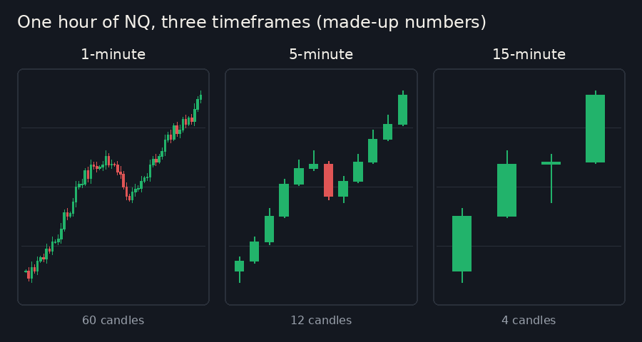
All three panels show the same hour and the same climb of about 60 points. The 1-minute panel is busy, full of small ups and downs. The 5-minute panel still shows the climb, the pullback in the middle and the climb again. The 15-minute panel turns the whole hour into four candles, and the pullback almost disappears.
Zoom in, zoom out
Timeframes work like the zoom on a map. Zoomed in, you see every street and every turn. Zoomed out, the streets fade away and the shape of the whole city appears.
Neither view is right or wrong. Each one answers a different question. A small timeframe answers "what is price doing right now?" A big one answers "where are we in the bigger picture?"
The most common big view is the daily chart, where each candle is one whole trading day. Two other big views come up in our posts: hourly candles (one per hour) and weekly candles (one per week).
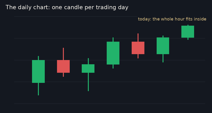
The hour from the first picture is a small part of today's single daily candle. A move that feels huge on a 1-minute chart can be a small wiggle on the daily.
Why our posts use more than one
The classroom uses big timeframes and small ones for different jobs.
The map comes from the big pictures. The zones in each lesson plan are built from highs and lows on the hourly, daily and weekly charts, along with yesterday's session and the overnight session. Those are places where many traders reacted before, which is why they are worth marking. The chart in the morning lesson is drawn in 15-minute candles, so a whole day and night fit on one picture.
The close-up comes from 5-minute candles. When price reaches a zone, a 5-minute candle is small enough to show how price behaves there, and big enough that one stray minute doesn't mislead anyone.
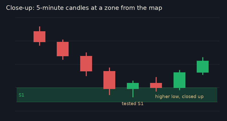
Seasoned traders often put it this way: the big timeframe tells them where to look, and the small one shows how price behaves when it gets there.
In our posts: "What happened: after testing S1, a 5-min candle made a higher low and closed up."
S1 is a zone from the map, built on the bigger timeframes. "A 5-min candle" is the close-up: it says which candles to look at to see that higher low. Level 2 explains how zones like S1 are built.
Recap
- A timeframe is how much time each candle holds; a bigger candle is several smaller ones combined.
- Small timeframes show detail; big ones (hourly, daily, weekly) show the bigger picture.
- Our zone map comes from the big pictures; our live posts read 5-minute candles.