
Level 2 · Lesson 9 · ~20 min
Zone strength: when timeframes stack
The chart lesson gives every zone a strength number from 0 to 100. That number answers one question: how much evidence piles up in this area? This lesson shows where the number comes from, and what it can and can't tell you.
Four timeframes, four tiers
The last lesson built zones from yesterday and overnight. The full map reaches much further back. It gathers reference prices from four timeframes, and the classroom calls each one a tier:
- Weekly: the highs and lows of past weeks, going back about six months.
- Daily: the highs, lows and closes of past trading days, going back about three months.
- Hourly: swing highs and lows on the 60-minute chart, going back about a month.
- Session: yesterday's session and the overnight session, from the last lesson.
Round numbers are added too, as the lightest ingredient of all.
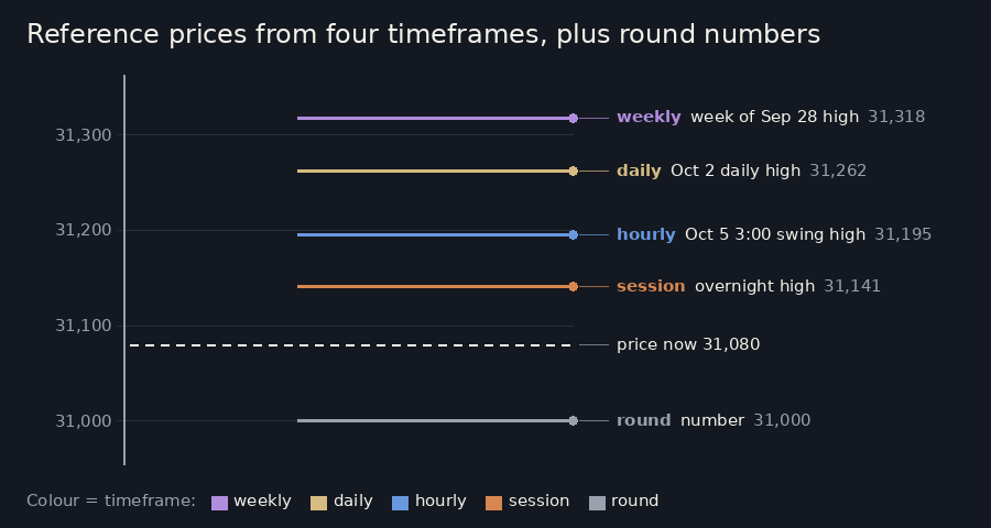
The bigger the timeframe, the more a price counts. A weekly high was watched by more traders, for longer, than a swing on the 60-minute chart. So weekly prices count the most, then daily highs and lows, then the session prices, then hourly swings, and round numbers least. Older prices also count a little less as the weeks go by.
When timeframes stack
Imagine asking for directions in a new town. One stranger says "turn left at the church". That's useful. Now the map says the same thing, a road sign agrees, and so does a local. You'd trust that turn a lot more.
Zones work the same way. Each reference price inside a zone adds to its score, and prices from different timeframes in the same area add up fast. A lone 60-minute swing high makes a weak zone. A weekly low, a daily low and the overnight low within a few points of each other make a strong one.
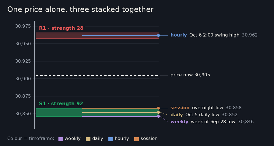
The scores are then scaled so the strongest zone on today's map is 100. Every other zone is measured against it: a zone at 50 holds about half as much evidence as the strongest. Zones that score below about 20 are left off the map.
The tier word beside a zone, such as "daily" or "hourly", names the timeframe that adds the most to it.
Turns that repeat
There's a second way a zone grows stronger. Each time price turns at a zone, it leaves a new swing high or swing low there. Sometimes it leaves a daily high or low as well. Those new reference prices join the zone, and its score climbs.
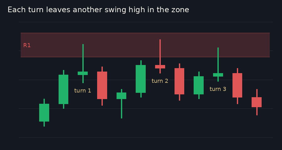
The number counts the turns, but it can't see how they looked. A seasoned trader also notices the shape: if each bounce away from a zone is smaller than the one before, the waiting orders there may be running out.
What the number means, and what it doesn't
A strength number tells you where to look harder. When price comes near a strong zone, a reaction is more likely to be worth studying. A strong zone close to price is often the first thing a seasoned trader circles in the morning.
It is not a promise. Strong zones break, sometimes quickly, and the number says nothing about which way price will go once it arrives. It's also relative to today's map, so a 70 today and a 70 next week aren't the same amount of evidence.
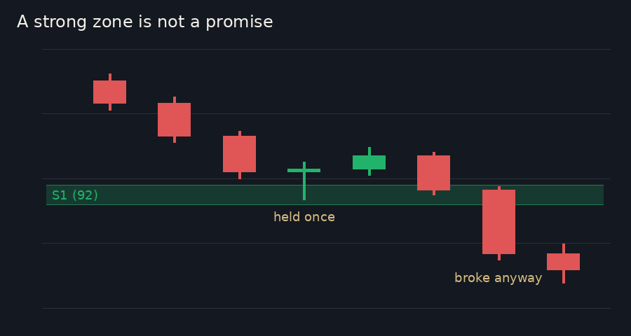
Behind the scenes, the classroom's study log records whether each zone held or broke, grouped by strength. That way the number keeps getting checked against what price actually did.
In our posts: "Look for overlap. A zone gets stronger when levels from different timeframes stack in the same area, and when price turned there more than once. That's what the strength number (0-100) measures."
That's the third step of the chart lesson. Both halves of it are in this lesson: stacking timeframes, and repeated turns.
Recap
- Reference prices come from four tiers, weekly, daily, hourly and session, plus round numbers; bigger timeframes count more.
- A zone's strength rises when several timeframes stack in one area and when price has turned there more than once; the strongest zone on today's map is 100.
- Strength says where to pay more attention, never what price will do.